Penalties and The World Cup ⚽
Unraveling the Chaos over the last 40 years

Have a knack for thinking outside the box and always looking for the next big idea.
Introduction and Inspiration 💡
First of all, Welcome back to Technical Speaking. It's been a while (three months, to be exact), and while I was busy with Uni and didn't get a chance to write, I'm still writing this blog while my End Semester Exams are going on. Not the brightest idea, but It's also World Cup season, and rules are meant to be broken this Holiday.
Getting into the real tech here, I found this excellent video by Vox Media, where they used a dataset of all the penalty shootouts in modern World Cup History (1982-Present). The dataset contained relevant data from the 1982 World cup in Spain to the 2018 World Cup in Russia. I thought of taking it a step further by adding the data for the 2022 World Cup in Qatar. Currently, the Quarter Finals are underway, and I'm watching Argentina decimate the Dutch 1-0 (watch me regret these words later).
Tech Stack and Code 👨🏻💻
I tried using plotly for my graphs, this time since Matplotlib graphs are a bit stale. Partially since a few Kaggle Graphs were already pre-written in plotly, and well *Hippady Hoppady, your code is now my property*.
Enough chatter; let's dive deep into the code ;)
Note: Even though this article may appear to be written in the past (because it was), all the graphs are Up-to-date as of the 18th of December, 2022 after the final.
import pandas
import pandas as pd
import plotly.express as px
from plotly.offline import init_notebook_mode, iplot
import base64
init_notebook_mode()

df = pd.read_csv('WorldCupShootouts.csv')
print("CSV file Loaded")
Just your standard importing of Libraries as well as creating the initial DataFrame from the CSV
Bar Graphs 🤓
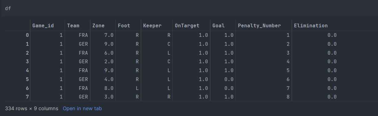
Displaying the DataFrame, we can see over 330 Spot Kicks spread over 40 years, starting from Germany vs. France 2(5)-2(4) in the 1982 Spain World Cup Semi-Finals.
df_country_count = pd.DataFrame(df.dropna().groupby(['Team']).size()).sort_values(by=0,ascending=False).reset_index().rename(columns={0:"Total Penalty Kicks"})
px.bar(df_country_count, x='Team', y="Total Penalty Kicks").show()
Now by graphing a plot between the Team Name and corresponding Penalty kicks, we can see that Argentina has had the most Penalty Opportunities.

And by plotting a similar graph, we can see that Argentina scored the most significant number of penalties.
df_most_goals = pd.DataFrame(df[df.Goal==1].groupby(['Team']).size()).sort_values(by=0, ascending=False).reset_index().rename(
    columns={0: "Total Penalties Scored"})
px.bar(df_most_goals, x='Team', y="Total Penalties Scored").show()

Goals Zones 🥅
Now we're going to look at goal zones and how shots were fired; for this, you will need to understand how zoning works. Here is a small infographic so you can understand how it works ;)
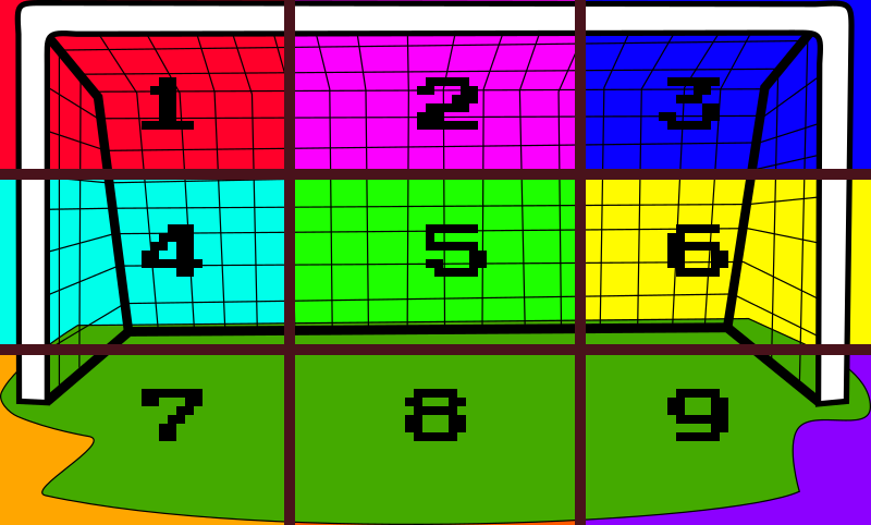
Now that you have a general sense of how the graphs will look let's define the function to help create these beautiful graphs.
def show_shots(df: pandas.DataFrame, x, y, size, size_max, hover_name, hover_data, color, title, image_filename="goal.jpg"):
    init_notebook_mode()
    fig = px.scatter(df,
                 x=x,
                 y=y,
                 size= size,
                 size_max = size_max,
                 color = color,
                 hover_name = hover_name,
                 hover_data = hover_data,
                 range_x = (0,900),
                 range_y = (581,0),
                 width = 900,
                 height = 581,
                 labels = {x:'', y:''})
    plotly_logo = base64.b64encode(open(image_filename, 'rb').read())
    fig.update_layout(xaxis_showgrid=False,
                    yaxis_showgrid=False,
                    xaxis_showticklabels=False,
                    yaxis_showticklabels=False,
                    title= title,
                    images= [dict(
                    source='data:image/jpg;base64,{}'.format(plotly_logo.decode()),
                    xref="paper", yref="paper",
                    x=0, y=1,
                    sizex=1, sizey=1,
                    xanchor="left",
                    yanchor="top",
                    sizing = 'stretch',
                    layer="below")])
    iplot(fig)
Now, we will try to determine which zone had the most "On Target" shots using a simple Group By Query in our DataFrame.
shot_coords = {
    1:[216,150],
    2:[448,150],
    3:[680,150],
    4:[216,250],
    5:[448,250],
    6:[680,250],
    7:[216,350],
    8:[448,350],
    9:[680,350]
}

df_target = df[df.OnTarget == 1]

df_target['Zone_x'] = df_target['Zone'].apply(lambda x: shot_coords[int(x)][0])
df_target['Zone_y'] = df_target['Zone'].apply(lambda x: shot_coords[int(x)][1])

df_zone = pd.DataFrame(df_target.groupby(['Zone','Zone_x', 'Zone_y']).size()).reset_index()
df_zone.rename(columns = {0:'Number of Shots'}, inplace= True)

show_shots(df_zone, 'Zone_x', 'Zone_y', 'Number of Shots', 70, 'Zone', ['Zone', 'Number of Shots'], 'Number of Shots', 'Shot Location (On Target Shots)')
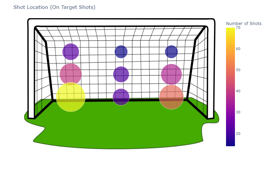
Looking at On Target shots can not be all of the Image; let's now look to the other extreme, the zone where the ball could never get on Target.
df_Offtarget = df[df.OnTarget == 0]

df_Offtarget['Zone_x'] = df_Offtarget['Zone'].apply(lambda x: shot_coords[int(x)][0])
df_Offtarget['Zone_y'] = df_Offtarget['Zone'].apply(lambda x: shot_coords[int(x)][1])

df_zone = pd.DataFrame(df_Offtarget.groupby(['Zone','Zone_x', 'Zone_y']).size()).reset_index()
df_zone.rename(columns = {0:'Number of Shots'}, inplace= True)

show_shots(df_zone, 'Zone_x', 'Zone_y', 'Number of Shots', 70, 'Zone', ['Zone', 'Number of Shots'], 'Number of Shots', 'Intended Shot Location (Off Target Shots)')
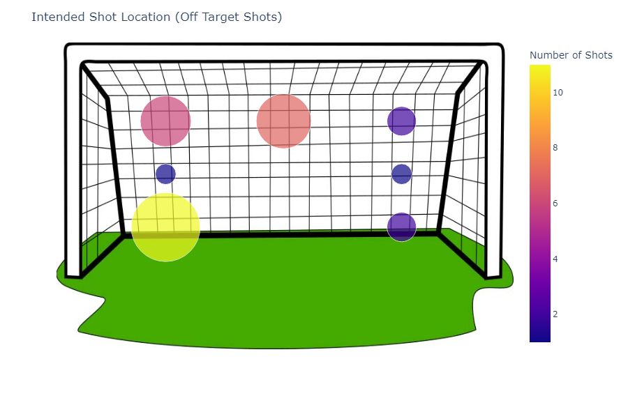
Oddly enough, most shots are inclined towards zone 7 (shown as a yellow circle here). We can also see that no shots in sectors 5 and 8 were ever missed, probably because they have the least risk of missing the net altogether.
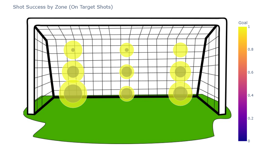
Now looking at goals in absolute numbers, let's figure out which zone was lucky! Which zone had the most goals, as well as which had the least number of successful attempts?
df_zone = pd.DataFrame(df_target.groupby(['Zone','Zone_x', 'Zone_y', 'Goal']).size()).reset_index()
df_zone.rename(columns = {0:'Number of Shots'}, inplace= True)

show_shots(df_zone, 'Zone_x', 'Zone_y', 'Number of Shots', 70, 'Zone', ['Zone', 'Number of Shots'], 'Goal', 'Shot Success by Zone (On Target Shots)')

for i in range(df_zone.shape[0]):
    zone = df_zone.loc[i, 'Zone']
    df_goal = df_zone[df_zone.Zone == zone]
    tot = df_goal['Number of Shots'].sum()
    goal = df_goal[df_goal.Goal == 1.0]['Number of Shots'].sum()
    df_zone.loc[i, 'Success Percentage'] = goal/tot

df_zone = df_zone[df_zone.Goal == 1.0]
show_shots(df_zone, 'Zone_x', 'Zone_y', 'Number of Shots', 70, 'Zone', ['Zone', 'Number of Shots', 'Success Percentage'], 'Success Percentage', 'Shot Success by Zone (On Target Shots)')
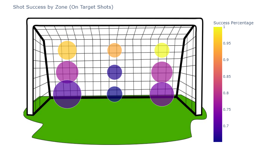
We notice what seemed obvious, the highest success rates are in the corners, with the upper right corner having a success rate of 100% (talk about beating the house), while zones 5 (center) and 8 (Lower Middle) have the lowest. Since Zone 7 (Bottom Left) had the most shots, it also had the most saves and goals. Now you know, if you're ever in a world cup match, ALWAYS aim for the corners. The top third is your best chance to net one in.
Enough talk about the shooter. Let's talk keeper statistics. How do we determine the number of times a keeper has chosen a specific side? The answer might be closer than you might think. Just scroll on down!
keeper_coords = {
    'L':[216,250],
    'C':[448,250],
    'R':[680,250],
}

df.dropna(inplace=True)

df.replace('l', 'L', inplace=True)
df['Keeper_x'] = df['Keeper'].apply(lambda x: keeper_coords[x][0])
df['Keeper_y'] = df['Keeper'].apply(lambda x: keeper_coords[x][1])

df_keeper = pd.DataFrame(df.groupby(['Keeper','Keeper_x', 'Keeper_y']).size()).reset_index()
df_keeper.rename(columns = {0:'Number of Shots'}, inplace= True)

show_shots(df_keeper, 'Keeper_x', 'Keeper_y', 'Number of Shots', 70, 'Keeper', ['Keeper', 'Number of Shots'], 'Number of Shots', 'Keeper Location')

Similarly, we can plot where the keeper landed most of the time and how many of those were goals vs. no goals.
keeper_coords = {
    'L':[216,250],
    'C':[448,250],
    'R':[680,250],
}

df.dropna(inplace=True)
df_no_goal = df[df.Goal==0]
df_no_goal.replace('l', 'L', inplace=True)
df_no_goal['Keeper_x'] = df_no_goal['Keeper'].apply(lambda x: keeper_coords[x][0])
df_no_goal['Keeper_y'] = df_no_goal['Keeper'].apply(lambda x: keeper_coords[x][1])

df_no_goal_keeper = pd.DataFrame(df_no_goal.groupby(['Keeper','Keeper_x', 'Keeper_y']).size()).reset_index()
df_no_goal_keeper.rename(columns = {0:'Number of Shots'}, inplace= True)
print(df_no_goal_keeper)

show_shots(df_no_goal_keeper, 'Keeper_x', 'Keeper_y', 'Number of Shots', 70, 'Keeper', ['Keeper', 'Number of Shots'], 'Number of Shots', 'Keeper Location (No Goal)')

keeper_coords = {
    'L':[216,250],
    'C':[448,250],
    'R':[680,250],
}

df.dropna(inplace=True)

df.replace('l', 'L', inplace=True)
df = df[df.Goal == 1]
df['Keeper_x'] = df['Keeper'].apply(lambda x: keeper_coords[x][0])
df['Keeper_y'] = df['Keeper'].apply(lambda x: keeper_coords[x][1])

df_keeper = pd.DataFrame(df.groupby(['Keeper','Keeper_x', 'Keeper_y']).size()).reset_index()
df_keeper.rename(columns = {0:'Number of Shots'}, inplace= True)

show_shots(df_keeper, 'Keeper_x', 'Keeper_y', 'Number of Shots', 70, 'Keeper', ['Keeper', 'Number of Shots'], 'Number of Shots', 'Keeper Location (Goal)')

We can see that the keeper stays in the middle the last time (take the hint) while he saves the most shots on the left side. Top Right is looking enticing now.
Foot Preference 👟
foot_coords = {
    'L':[270,520],
    'R':[600,520],
}

df.dropna(inplace=True)

df.replace('l', 'L', inplace=True)
df['Foot_x'] = df['Foot'].apply(lambda x: foot_coords[x][0])
df['Foot_y'] = df['Foot'].apply(lambda x: foot_coords[x][1])

df_feet = pd.DataFrame(df.groupby(['Foot','Foot_x', 'Foot_y']).size()).reset_index()
df_feet.rename(columns = {0:'Number of Shots'}, inplace= True)

show_shots(df_feet, 'Foot_x', 'Foot_y', 'Number of Shots', 70, 'Foot', ['Foot', 'Number of Shots'], 'Number of Shots', 'Left or Right Footed', 'stance.jpg')

Most players shoot with their right foot, which makes it way more likely for the ball to end up on the left side of the goal (Zone 1,4, and 7). This trend can be seen in our data and the corresponding plots. Left-footed players scoring in the top right will make or break this world Cup!
Conclusion [Post World Cup Final Results]
Vamos Argentina, Messi, and his team deserved the win after that heart-pounding 120-minute match which ultimately ended in penalties. Don't worry. The Data was updated, and the graphs were redrawn. For all my Data, as well as the Jupyter Notebook, you can check out the GitHub link to the Repository. Cheers, and see you in LA, 2026!